


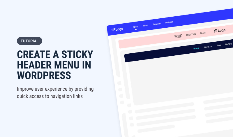
Sticky headers have become a popular web design feature in recent years, with many website owners and designers incorporating them into their sites. But what exactly are sticky headers, and what are the advantages and disadvantages of using them? In this article, we'll look closer at the pros and cons of sticky headers, explore when and where they might be most effective, and how to create one for your WordPress site.
Table of Contents
- What is a Sticky Header
- The Pros of Using Sticky Headers
- The Cons of Using Sticky Headers
- When and Where to Use Sticky Headers
- Types of Sticky Headers
- Examples of Sticky Headers
- How to Create a CSS Sticky Navigation Header in WordPress
- Tips for Creating Effective Sticky Headers
- Conclusion
What is a Sticky Header
Sticky headers, also known as fixed headers or floating headers, are web design feature that allows a header or menu to remain visible on the screen as a user scrolls down a page. This can be achieved through CSS or JavaScript and typically involves setting a fixed position for the header element.
Sticky headers can be used for various purposes, such as providing quick access to navigation links, highlighting important information or calls to action, or reinforcing branding and identity.
The Pros of Using Sticky Headers
There are several potential advantages to using sticky headers on a website. Here are some of the key benefits:
Improved User Experience
Sticky headers can improve the user experience by providing quick access to navigation links and other important information. This can make it easier for users to find what they're looking for and reduce frustration or confusion when navigating a site.
Increased Engagement and Conversions
Sticky headers can increase engagement and conversions by highlighting important calls to action or other information. For example, a sticky header might include a prominent "Sign Up" button or a banner promoting a sale or promotion. By keeping this information visible as a user scrolls down the page, sticky headers can help to drive conversions and encourage users to take action.
Better Navigation and Accessibility
Sticky headers can also improve navigation and accessibility by providing a consistent, easy-to-use interface for accessing important links and information. This can be particularly useful on long pages with lots of content, where users might otherwise have to scroll back to the top of the page to access the navigation menu.
Enhanced Branding and Identity
Sticky headers reinforce branding and identity by prominently displaying a company logo or other visual elements. This can help create a cohesive look and feel across a site and improve brand recognition and recall.
Improved Mobile Experience
Sticky headers can also improve the mobile experience of a website. Smaller screens can be challenging to provide access to all the necessary links and information without cluttering the screen or making it difficult to navigate. Sticky headers can help to provide a more streamlined and user-friendly mobile experience by ensuring that important information and links are always visible and accessible.
The Cons of Using Sticky Headers
While there are many potential benefits to using sticky headers, there are also some potential drawbacks. Here are some of the key disadvantages:
Can Be Distracting or Intrusive
Sticky headers can be distracting or intrusive if they are not implemented carefully. For example, if the header is too large or contains too much information, it can take up too much screen real estate and make it difficult for users to focus on the page's content. Similarly, if the header is too flashy or animated, it can distract or annoy users.
May Not Be Suitable for All Websites or Pages
Sticky headers may not be suitable for all websites or pages. For example, on pages with a lot of content, a sticky header may take up too much real estate screen and make it difficult to read or navigate the content. Similarly, a sticky header may be unnecessary or distracting on pages focused on visual elements or multimedia content.
Can Affect Website Performance and Speed
Sticky headers can also affect website performance and speed, particularly on mobile devices or slower internet connections. The JavaScript or CSS required to implement a sticky header can add to the page load time, leading to slower page speeds and a poorer user experience.
Can Be Overused or Misused
Finally, sticky headers can be overused or misused, leading to a poor user experience. For example, if a site has multiple sticky headers or the headers are implemented confusingly or inconsistently, it can be difficult for users to navigate the site or understand its structure.
When and Where to Use Sticky Headers
So, when and where should you use sticky headers? The answer depends on various factors, including the purpose of your website, your pages' content, and your target audience's preferences. Here are some general guidelines to keep in mind:
- Use sticky headers sparingly and only when they benefit the user experience.
- Consider the content and structure of your pages when deciding whether to use a sticky header. A sticky header may be helpful if your pages are long and complex. A sticky header may be unnecessary if your pages are short or focused on multimedia content.
- Test your sticky headers on various devices and internet connections to ensure they don't negatively impact website performance or speed.
- Consider the preferences of your target audience when deciding whether to use a sticky header. Some users may find them helpful, while others may find them distracting or annoying.
Types of Sticky Headers
Depending on the website's design and functionality, several types of sticky headers can be used. Let's explore them

Standard Sticky Headers
Standard sticky headers are the most common type of sticky headers used by web designers. This sticky header remains fixed at the top of the screen as the user scrolls down a webpage. Standard sticky headers usually contain the website's logo, navigation menu, and other important links.
Shrink/Minimize Sticky Headers
Shrink/minimize sticky headers are similar to standard sticky headers but with one major difference. When a user scrolls down a webpage, the shrink/minimize sticky header reduces in size to give the user more screen space. This sticky header is useful for websites with a lot of content and wants to give users more screen space to view the content.
Sticky Footer Headers
Sticky footer headers differ from standard sticky headers in that they remain fixed at the bottom of the screen as the user scrolls down a webpage. This sticky header usually contains important social media links, copyright information, and other legal information.
Slide-In Sticky Headers
Slide-in sticky headers are more subtle and slide into view as the user scrolls down a webpage. This sticky header usually contains the website's logo, navigation menu, and other important links.
Hamburger Menu Sticky Header
The "hamburger menu" is a common icon consisting of three horizontal lines stacked on each other. When clicked or tapped, it opens a menu with navigation options usually displayed in a sticky header. Combining these two design elements means that the hamburger menu icon remains visible and accessible to the user at all times, even as they scroll through the content on the page. This design pattern is often used to maximize screen real estate, providing users with a streamlined and minimalist interface that only displays navigation options when needed.
Full-Screen Sticky Headers
Full-screen sticky headers are a more dramatic type of sticky header that takes up the entire screen as the user scrolls down a webpage. This sticky header usually contains the website's logo, navigation menu, and other important links.
Examples of Sticky Headers
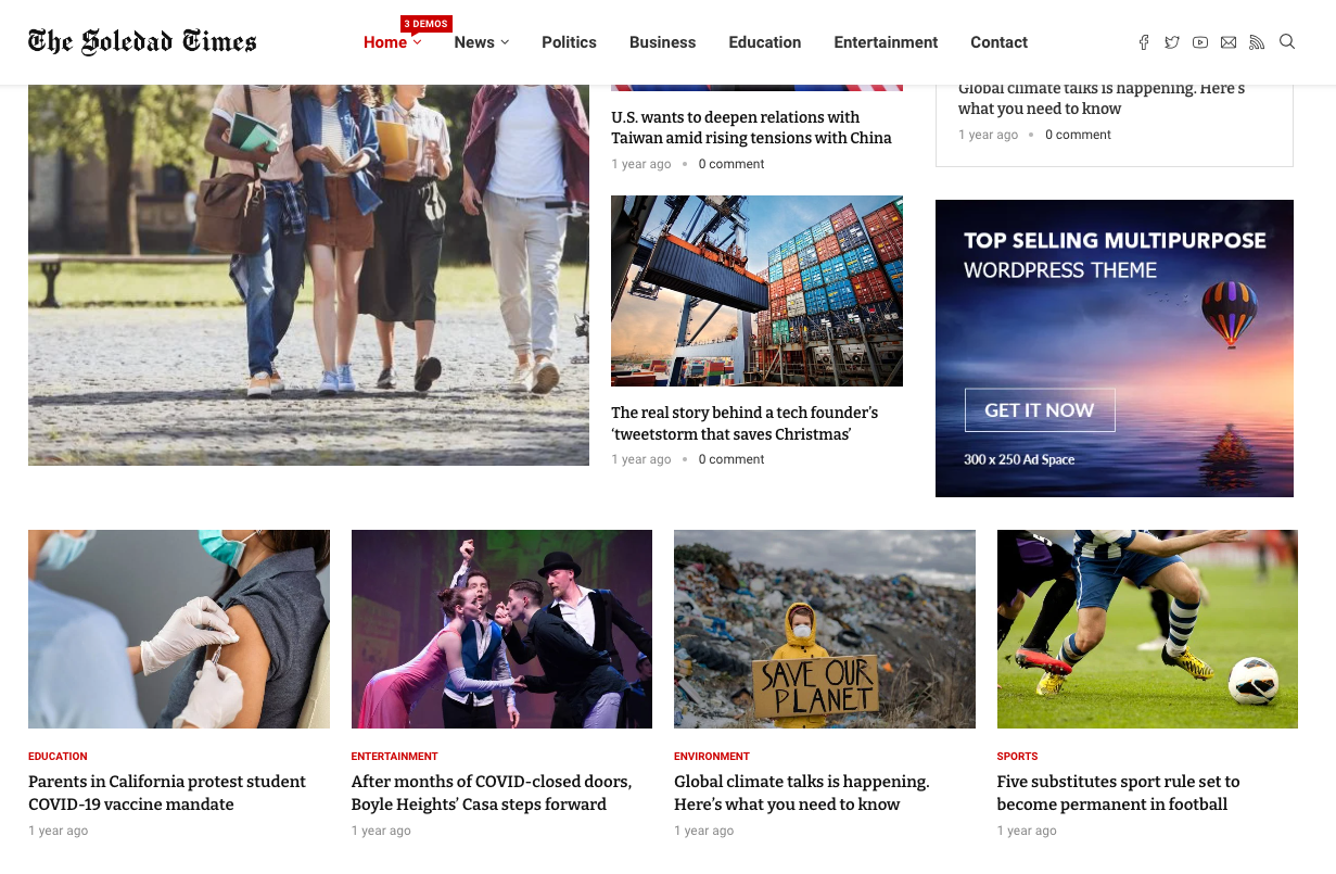
A fixed header navigation menu is a website navigation menu that remains fixed at the top of the screen even as the user scrolls down the page. This type of menu can be useful in many different contexts, and here are some real-world use cases and examples:
- E-commerce websites: On e-commerce websites, a fixed header navigation menu can help users easily access different product categories and subcategories as they browse through different pages. It can also provide quick access to the shopping cart and the search function.
- News websites: News websites can benefit from a fixed header navigation menu that provides easy access to different sections of the website, such as sports, entertainment, and politics. This makes it easier for users to navigate the site and find their desired content.
- Corporate websites: Corporate websites often have a lot of information to convey, and a fixed header navigation menu can make it easier for users to access different pages and sections of the site. This is especially useful if the site has a lot of sub-pages and subsections.
- Online learning platforms: Online learning platforms such as Coursera or Udemy often have a lot of different courses and modules that users can access. A fixed header navigation menu can help users easily access different courses and modules, track their progress, and manage their account settings.
- Social media platforms: Social media platforms such as Facebook and Twitter can benefit from a fixed header navigation menu that provides quick access to different features and sections of the site. For example, the menu might include links to the user's profile, the newsfeed, notifications, and messaging.
Overall, a sticky header navigation menu can be useful in any context where there are multiple pages or sections to navigate and where users need to access different features or pieces of content quickly.
How to Create a CSS Sticky Navigation Header in WordPress
This section will show you how to create a WordPress sticky navigation menu with CSS.
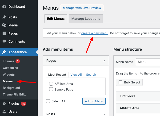
Step 1: Create a New Menu
First, you need to create a new menu in your WordPress dashboard. Go to Appearance > Menus and create a new menu by clicking the "+ Create a new menu" button. Give your menu a name, then add the pages you want to include in the navigation. Once you've added all of the pages, save the menu.
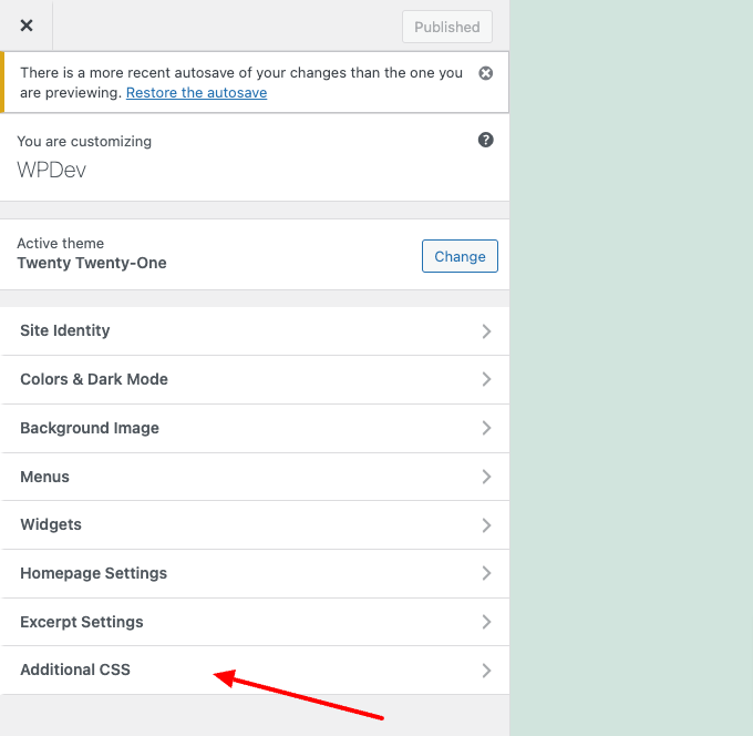
Step 2: Add CSS
Now it's time to add the CSS code to make the menu sticky. Go to Appearance > Customize and click the "Additional CSS" tab.
Then, paste the following CSS code:
#site-navigation {
    position:fixed;
    top:0;
    left:0;
    background:#fff;
    z-index:9999;
    border-bottom:1px solid #dadada;
    width:100%;
    text-align: center;
    box-shadow: 0 0 10px rgba(0,0,0,0.2);
}
#site-navigation .menu-wrapper {
    justify-content: center;
}
This code will make the menu sticky to the top of the screen and give it a white background with a drop shadow.
Step 3: Adjust the CSS
You may need to adjust the CSS code to fit your website's style. For example, you may want to change the background color or the box shadow. You can also add CSS to change the font size, color, or any other desired styling options.
Step 4: Save your changes
Once you are happy with the CSS changes, save your changes by clicking on the "Publish" button. Your WordPress sticky navigation menu is now complete!
Tips for Creating Effective Sticky Headers
Now that we understand the importance of sticky headers let's look at some tips for creating effective ones.
Keep it Simple
Your sticky header should be simple and easy to use. Avoid cluttering it with too many options or links. Stick to the most important items, such as the main menu, search box, and social media icons.
Make it Stand Out
Your sticky header should stand out from the rest of the page, so users can easily find it. Use a different color or font to make it more noticeable. You can also add a drop shadow or border to make it more prominent.
Use Clear Labels
Make sure the labels on your sticky header are clear and easy to understand. Use simple, concise language to describe each option. Avoid using industry jargon or confusing terminology.
Optimize for Mobile
More and more users are accessing websites on their mobile devices, so optimizing your sticky header for smaller screens is important. Use a responsive design that adjusts to the size of the screen. Ensure the buttons and links are large enough to click on a touch screen easily.
Test it Out
Once you've created your sticky header, test it to ensure it's effective. Ask a few users to try it out and provide feedback. Make any necessary changes based on their feedback.
Conclusion
Sticky headers can improve the user experience but can be overused or misused. To decide whether to use a sticky header, consider the purpose of the website and the target audience's preferences. You can create effective, engaging websites that provide a positive user experience by carefully weighing the pros and cons.
We hope that you found this article informative and helpful. If you have any questions or feedback, please feel free to comment below. Thank you for reading!
Get FireBox for Free
Enter your WordPress website URL to install instantly.
Trusted by 9,000+ users
0 Comments