
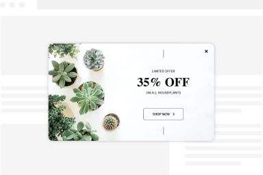
Design Section
The Design section allows you to set the look and feel of your popup. Below, we list all available settings with helpful descriptions.
Below you can find each setting per Design section.
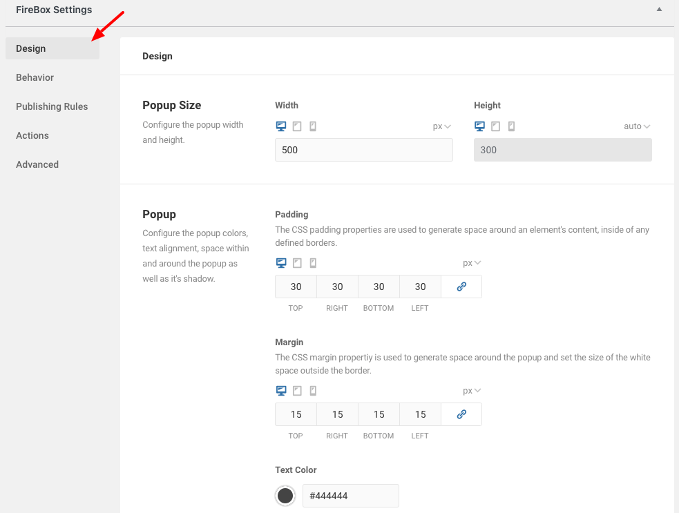
Popup Size
Configure the popup width and height.
| Setting | Description | Notes |
|---|---|---|
| Width | Set the width of the popup for desktop/tablet/mobile devices in various measurements. | |
| Height | Set the height of the popup for desktop/tablet/mobile devices in various measurements. | The "auto" measurement makes the popup's height adjust based on its content. |
Campaign
Configure the campaign colors, text alignment, space within and around the popup as well as it's shadow.
| Setting | Description |
|---|---|
| Font Size | Set the font size of the popup. |
| Padding | The CSS padding properties are used to generate space around an element's content, inside of any defined borders. |
| Margin | The CSS margin propertiy is used to generate space around the popup and set the size of the white space outside the border. |
| Text Color | Set the text color within the popup. |
| Background Color | Set the popup's background color. |
| Align Content | Set the position of the text within the popup. |
| Shadow | Set the popup shadow. |
Close Button
You can configure the popup's close button by displaying either an icon or an image of your choice. You may also delay its appearance to ensure the popup gets the visibility you need.
| Setting | Description |
|---|---|
| Close Button | Show the close button within the popup, outside the popup, or hide it. |
| Choose Button Type | Whether the button type will be an icon or an image. |
| Select Image | Select the close button image. |
| Color | Close button color. |
| Hover Color | Close button hover color. |
| Font Size | Close button font size. |
| Delay | Set a delay until the close button appears. |
Animations
Set the entrace & exit animations of the popup as well as the duration of the animation.
| Setting | Description |
|---|---|
| Open Animation | Set the opening animation of the popup. |
| Close Animation | Set the closing animation of the popup. |
| Duration | Set the animation duration |
Border
Set the border style, color, width and radius.
| Setting | Description |
|---|---|
| Style | Set the popup border style. |
| Color | Set the border color. |
| Width | Set the border width. |
| Radius | Set the radius of the popups corners. |
Overlay
Configure the popup background overlay to bring your popup's content to your users attention.
| Setting | Description |
|---|---|
| Toggle | Enable/Disable overlay. |
| Background Color | Set the background color of the overlay. |
| Blur Background | To make the overlay background blur, set the radius of the blur. The higher the radius, the more blur the background will be. |
| Close on Click | Set whether the popup can close upon clicking the overlay. |
Background Image
Set the background image settings, repeat, size and position.
| Setting | Description |
|---|---|
| Toggle | Enable/Disable background image. |
| Image | Set the background image. |
| Repeat | Set whether the image should repeat or not. |
| Size | Set the image size. |
| Position | Set the position of the image. |
