
Form Settings
The “Form” block contains a variety of settings both for styling and functionality purposes that allow you to make the form fit your theme’s style. Below, we will find all form settings that you can configure.
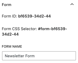
Form
The form settings contain information about the form.
| Setting Name | Description |
|---|---|
| Form ID | This is the Form unique ID. |
| Form CSS Selector | You can use the Form ID CSS Selector to apply custom CSS to your form. |
| Form Name | You can define a custom name to your form here. |
Design
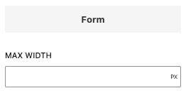
Form Settings
Define design settings related to the form.
| Setting Name | Description |
|---|---|
| Max Width | Set the max width of the form. |
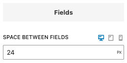
Fields Settings
Define design settings related to the form fields.
| Setting Name | Description |
|---|---|
| Space between fields | Set the vertical space between form fields. |
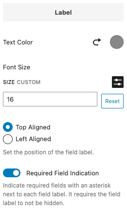
Label Settings
Define design settings related to the form field labels.
| Setting Name | Description |
|---|---|
| Text Color | Set the label text color. |
| Font Size | Set the label font size. |
| Label Position | Set the label position. Define whether it will appear at the top of on the left side. |
| Required Field Indication | Set whether to display an asterisk next to required fields. |
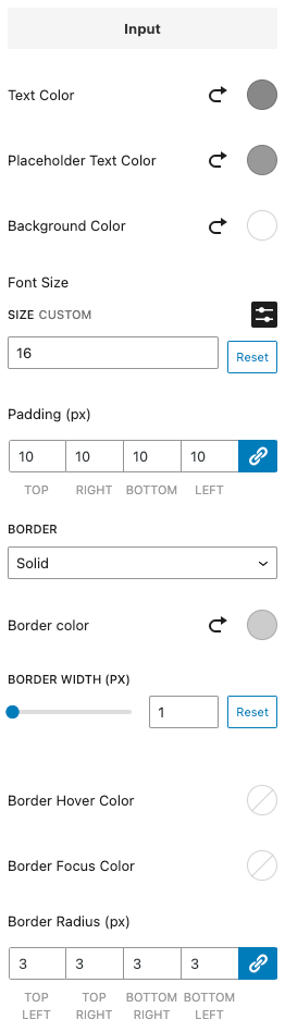
Input Settings
Define design settings related to form input fields.
| Setting Name | Description |
|---|---|
| Text Color | Set the input text color. |
| Placeholder Text Color | Set the input placeholder text color. |
| Background Color | Set the input background color. |
| Font Size | Set the input font size. |
| Padding | Set the input padding. |
| Border | Set the input border. |
| Border Radius | Set the input border radius. |
Actions
Define what actions to perform after the form has been successfully submitted.
You can read detailed documentation on each supported integration on the Integrations documentation page.
Behavior
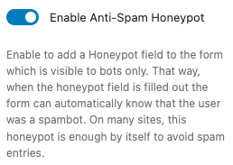
Define behavior settings related to the form.
| Setting Name | Description |
|---|---|
| Enable Anti-Spam Honeypot | Enabling this adds an anti-spam protection against bots trying to submit your form. This should reduce any spam submissions you get so we recommend having it enabled. |
Submission
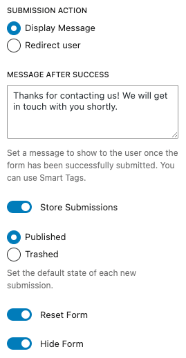
Define settings related to the submission.
| Setting Name | Description |
|---|---|
| Submission Action | Define what action to perform after the form has been successfully submitted. Choose between displaying a message to the user or redirecting the user to a specific URL. |
| Message After Success | Set the success message. |
| Redirect URL | Enable storing submissions on your server. |
| Store Submissions | Enable to store submissions on your server. |
| State | Select whether to store the submission as Published or Trashed. |
| Reset Form | Set whether to reset the form when it’s successfully submitted. |
| Hide Form | Set the URL to redirect the user. |
Validation
Define error message validation settings.
| Setting Name | Description |
|---|---|
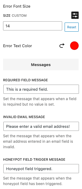
| Error Font Size | Set the error message font size. |
| Error Text Color | Set the error message text color. |
| Required Field Message | Set the message that will appear when the form is submitted and the required fields are not filled. |
| Invalid Email Message | Set the message that will appear when an invalid message is entered. |
| Honeypot Field Trigger Message | Set the message that will appear when the form is submitted but the honeypot field is triggered. |
Success Message
Define success message settings.
| Setting Name | Description |
|---|---|
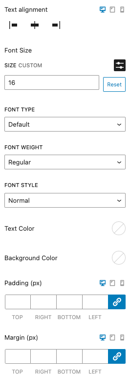
| Text alignment | Define the alignment of the success message. |
| Font Size | Set the font size. |
| Font Type | Set the font type. |
| Font Weight | Set the font weight. |
| Font Style | Set the font style. |
| Text Color | Set the text color. |
| Background Color | Set the background color. |
| Padding | Set the padding of the message. |
| Margin | Set the margin of the message. |
Smart Tags
The Email Notification and “Message After Success” sections accept Smart Tags, allowing you to send personalized messages to your users.
You can find all available Smart Tags here: How to use Smart Tags.
Frequently Asked Questions
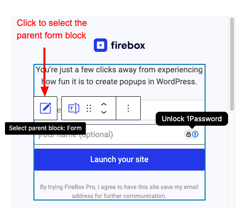
Why can’t I select the form when clicking directly in the form blocks?
When you try to select the form block, you essentially select the Gutenberg block that appears in front of you, in most cases it’ll be a form field (Text field, Email field, Buttons field, etc…). This means you don’t directly select the form block.
To select the form block, you have two options:
Method #1
From the left-hand panel (Document Overview) > select the Form block.
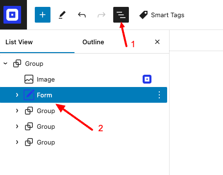
Method #2
Click on a form field block > select the parent element which automatically selects the form block.